Stocks or Bonds?
March 19, 2008 By Alan J. Salzberg
A couple of posts ago, I talked about the question of whether to rent or buy (the answer: in the long run, buy; in the short run, rent). With all the turmoil in the financial market, it seems a reasonable time to visit the question of whether stocks or bonds are a better investment.
If you look at data from 1929-2007 for the Dow Jones Industrial Average (DJIA), a 20 year investment in stocks yielded an inflation-adjusted return of about 2.6% annually. This is before taking dividends into account, which add at least a couple percent (recently, the dividend yield has been closer to 2% while in the past 4-5% was the norm, see this article for relevant charts). The net return for stocks, after inflation, is around 6% annually.
For bonds, the returns also generally beat inflation, but are not as good. Their average is around 2% annually, after subtracting out inflation.
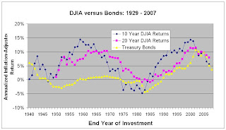
The following chart shows the DJIA inflation adjusted for 10 and 20 year investments (in blue and purple, downloaded from Yahoo Finance), versus Treasury bonds (in yellow). The US Treasury Bond return is based on 20-year bonds when available from the Fed and 10 year bonds or estimating using the article sited above when 20-year returns were not available.
The year shown is the final year of the investment. Thus, if you made a 20 year investment beginning in 1985, you can look at the points corresponding to 2005 to find out that you would have earned approximately 10% annually, whether it was in bonds (yellow) or stocks (purple for 20 year) by the start of 2005, and that is after inflation.
[Click on the graph see it in higher resolution]

The yellow line, denoting Treasury bond returns, is mostly below the blue and purple lines, indicating that, for most years, a 10 or 20 year investment in the Dow Jones Index is better than a similar investment in Treasury bonds. In fact, for 57 of the 68 ten-year investments, stocks do better. For 20 year investments, the numbers are even more promising for stocks, which perform better for 56 out of 57 20-year investments.
Treasury Bonds, on the other hand, are considered risk-free. The idea is that there is no risk that the U.S. Treasury will default on its loan (or, at least, if it does default, there are far more serious problems to worry about). On the other hand, with stocks, there are no guarantees that they will not go down.
This basic idea, that stocks have broadly out-performed bonds and beaten inflation in the long run, seems to be well-understood. This fact, however, does not imply that individual stock investments will outperform bonds, or that a shorter term investment will outperform.
The "truth" about stocks that is implied by this graph, however, is a little deceiving, for three reasons.
1. The graph tells you little about what might happen to a 20-year investment beginning in a particular year
The graph shows that for most time periods, stocks do well, but there is an enormous amount of variation, even for the long-term investments considered here. If you happened to make some long-term investments in 1962, at the end of a recession and the beginning of a long boom, you'd still be out of luck if you needed that money in 1982, when its real value would have been far less than when you invested it (the pink point corresponding to 1982 shows a 1% annual loss for the 20 prior years, amounting to about an 18% total loss in real dollars).
[The "safe" Treasury bond portfolio, however, would have done far worse, losing about twice as much over the same period. This is not because the US defaulted on its bonds. Instead, it's because of inflation. The 20-year bond you bought in 1962, yielding 4%, did not keep up with inflation. This is the long-term, somewhat hidden risk for bonds.]
2. The graph averages over a portfolio of stocks
The other issue is that despite the graphs very clear implication that stocks are better, even in bad times, this does not necessarily imply that individual stocks are better. Returns on an individual stock, or even on a small portfolio of stocks, vary much more wildy than the Dow Jones average shown in the graph. Also, in recent years, the Treasury has issued inflation-indexed bonds, which guarantee a real return above 0, thus insuring the yellow line in a future graph will be more than 0 (see information on inflation-indexed bonds).
3. The future is not now
While it seems convincing that 80 years of history show stocks in a very positive light, we only need to look at Japan, whose Nikkei average, since 1985, has lost about 15% adjusting for inflation (it's far more than 50% for an investment made near Japan's stock market peak). There are some indications that the current U.S. problems (real estate boom and bust, credit problems) are worse than Japan's. Much of U.S. investment in the last few decades has been fueled by the safety of the dollar. The rise of the Euro and of globalization has already begun to change that, and a continuing fall in the dollar will almost certainly cause inflation, which was devastating to the stock market in the 1970's.
Bottom Line
There's a lot of evidence that, in the past, a long-term stock investment paid off, relative to both risk-free bonds and inflation. However, there is no guarantee this party will continue, especially if there is a sea-change in dollar investments.
Where's my retirement money? Almost all in stocks...but almost all foreign stocks.
If you look at data from 1929-2007 for the Dow Jones Industrial Average (DJIA), a 20 year investment in stocks yielded an inflation-adjusted return of about 2.6% annually. This is before taking dividends into account, which add at least a couple percent (recently, the dividend yield has been closer to 2% while in the past 4-5% was the norm, see this article for relevant charts). The net return for stocks, after inflation, is around 6% annually.
For bonds, the returns also generally beat inflation, but are not as good. Their average is around 2% annually, after subtracting out inflation.
The following chart shows the DJIA inflation adjusted for 10 and 20 year investments (in blue and purple, downloaded from Yahoo Finance), versus Treasury bonds (in yellow). The US Treasury Bond return is based on 20-year bonds when available from the Fed and 10 year bonds or estimating using the article sited above when 20-year returns were not available.
The year shown is the final year of the investment. Thus, if you made a 20 year investment beginning in 1985, you can look at the points corresponding to 2005 to find out that you would have earned approximately 10% annually, whether it was in bonds (yellow) or stocks (purple for 20 year) by the start of 2005, and that is after inflation.
[Click on the graph see it in higher resolution]

The yellow line, denoting Treasury bond returns, is mostly below the blue and purple lines, indicating that, for most years, a 10 or 20 year investment in the Dow Jones Index is better than a similar investment in Treasury bonds. In fact, for 57 of the 68 ten-year investments, stocks do better. For 20 year investments, the numbers are even more promising for stocks, which perform better for 56 out of 57 20-year investments.
Treasury Bonds, on the other hand, are considered risk-free. The idea is that there is no risk that the U.S. Treasury will default on its loan (or, at least, if it does default, there are far more serious problems to worry about). On the other hand, with stocks, there are no guarantees that they will not go down.
This basic idea, that stocks have broadly out-performed bonds and beaten inflation in the long run, seems to be well-understood. This fact, however, does not imply that individual stock investments will outperform bonds, or that a shorter term investment will outperform.
The "truth" about stocks that is implied by this graph, however, is a little deceiving, for three reasons.
1. The graph tells you little about what might happen to a 20-year investment beginning in a particular year
The graph shows that for most time periods, stocks do well, but there is an enormous amount of variation, even for the long-term investments considered here. If you happened to make some long-term investments in 1962, at the end of a recession and the beginning of a long boom, you'd still be out of luck if you needed that money in 1982, when its real value would have been far less than when you invested it (the pink point corresponding to 1982 shows a 1% annual loss for the 20 prior years, amounting to about an 18% total loss in real dollars).
[The "safe" Treasury bond portfolio, however, would have done far worse, losing about twice as much over the same period. This is not because the US defaulted on its bonds. Instead, it's because of inflation. The 20-year bond you bought in 1962, yielding 4%, did not keep up with inflation. This is the long-term, somewhat hidden risk for bonds.]
2. The graph averages over a portfolio of stocks
The other issue is that despite the graphs very clear implication that stocks are better, even in bad times, this does not necessarily imply that individual stocks are better. Returns on an individual stock, or even on a small portfolio of stocks, vary much more wildy than the Dow Jones average shown in the graph. Also, in recent years, the Treasury has issued inflation-indexed bonds, which guarantee a real return above 0, thus insuring the yellow line in a future graph will be more than 0 (see information on inflation-indexed bonds).
3. The future is not now
While it seems convincing that 80 years of history show stocks in a very positive light, we only need to look at Japan, whose Nikkei average, since 1985, has lost about 15% adjusting for inflation (it's far more than 50% for an investment made near Japan's stock market peak). There are some indications that the current U.S. problems (real estate boom and bust, credit problems) are worse than Japan's. Much of U.S. investment in the last few decades has been fueled by the safety of the dollar. The rise of the Euro and of globalization has already begun to change that, and a continuing fall in the dollar will almost certainly cause inflation, which was devastating to the stock market in the 1970's.
Bottom Line
There's a lot of evidence that, in the past, a long-term stock investment paid off, relative to both risk-free bonds and inflation. However, there is no guarantee this party will continue, especially if there is a sea-change in dollar investments.
Where's my retirement money? Almost all in stocks...but almost all foreign stocks.