It's all about stopping exponential growth
March 22, 2020 By Alan SalzbergThe last few days we've had about 50 deaths per day. Some say: no big deal. That's fewer than 20,000 deaths a year -- like a seasonal flu. The problem, though, is that right now, in the US, deaths from COVID-19 are still increasing at an exponential rate. This means they double every few days. The 50 deaths per day will quickly yield to 100s, which will quickly yield to 1,000s, if we do nothing.
Estimating the exponential curve from current deaths, and assuming this rate of growth continues, we will be at about 3,000 deaths in 10 days (from about 400 now), more than 20,000 in 20 days, and at over 100,000 in 30 days.
But I think that won't happen. Why? Because similar closures (not the extreme lockdown of not going outside they are talking about imposing now), curbed exponential growth in death rate in about 10 days in Italy. This means the closures have an immediate affect on infection. In China, this was also true, though they very quickly moved to an extreme lockdown.
This means, that, if we assume we now have similar nationwide closures as Italy did 15 days ago, the increase in deaths will start to drop off in early April (at which point we could have nearly, or even over, 1,000 deaths per day). This doesn't mean no one else will die after that. In China, at least three-quarters of the deaths occurred after the shutdown. Thus, what we might see in April is hundreds of people dying every day -- many more than are dying now, but it will begin to decline from its peak.
The net result: If we consider today the full shutdown, we might have about 12,000 US deaths over the next 6 weeks. Do we have a full shutdown now? Certainly, the measures now in place in CA, NY, and WA are a full shutdown. A full shutdown is not 100% social isolation but includes no large or even modest public gatherings, and schools and offices closed. This is more in line with what Italy was doing in early March. And this worked.
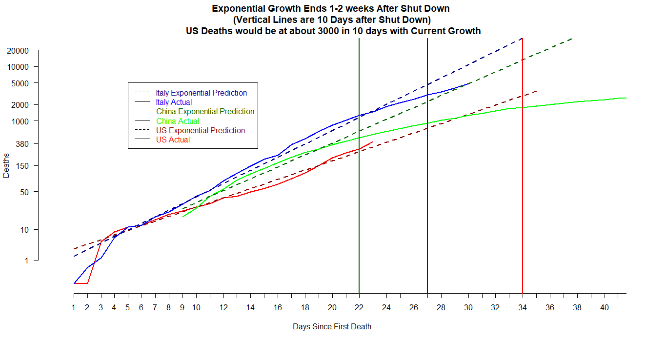
The graph below shows deaths on an exponential scale, along with model predictions (for a very simple exponential growth model estimated for each of the three countries). On the exponential scale, you will see a straight line if there is exponential growth (note the labels on the y-axis increase very quickly). The solid blue line is Italy's actual deaths, and you can see it is below its predicted line (the dashed blue line) for a few days now -- roughly since 10 days after the shut down (the blue vertical line). This means deaths are no longer growing exponential (despite the high number of daily deaths). For China (in green), the solid line fell below the dashed line at almost exactly the 10 day mark. For the US, the solid line is still almost exactly at exponential growth, where it might continue for another 10 days (roughly 3,000 deaths).
One more thing to note -- the dashed lines (predicted growth rates) have different slopes. This is likely due to different rates of infection but there are many other factors that could affect that, including the fact that each country's curve is really an amalgam of all the growth rates of all the different regions, where the virus began at different times and spread at different rates. Also, the death rate, though roughly indicative of infections 2-3 weeks prior, includes people who died well before or well after the typical 2-3 weeks delay between infection and death, so all figures summarize across both region and time in a complicated and unknown manner.
