What does the peak mean?
April 12, 2020 By Alan SalzbergToday I am going to talk about just one graph, below, which shows new deaths on a log scale for several states, for New York City, for the U.S. and for Italy.
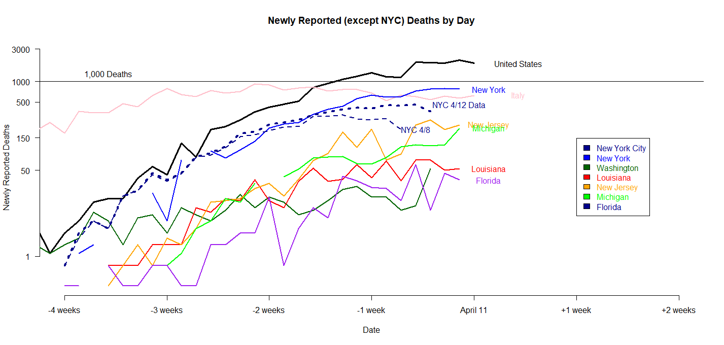 I'll start with the most curious part. I have two NYC lines. One, labeled NYC 4/8, shows deaths per day according to the NYC Department of Health on 4/8. The other, labeled NYC 4/12 Data, shows deaths per day according to the NYC Department of Health on 4/12 (today). Note that the more recent line shows not just more days of data but a higher number of deaths for the same days for about 2 weeks in the past until the present. This is because the NYC Department of Health takes the daily "reported" deaths and then, over the course of a few days, tries to figure out what day the death actually occurred. From the fact that the more reent line is higher (rather than the same) even when we go back 2 weeks means that reported deaths today may be for people who died up to weeks prior.. Therefore, while my last blog stated the peak of NYC was around April 1, now it looks more like April 6. Unfortunately, it may be that as more data comes in, we will find it is later, or hasn't happened yet. It does appear that exponential growth has peaked or at least slowed greatly, though, as the line appears to either not sloping upward as of about a week and a half ago, or barely sloping upward.
For the states, the US, and Italy, I only have reported deaths, so we might assume they lag some. Also, as I said in my last blog, there is a great deal of evidence indicated many deaths are not being reported (see, for example, the New York Time article).
With that in mind, we can see that New York State and the US in general seem to have flattened. New York State has had a few days of very high, but not increasing deaths reported now. So perhaps New York State has peaked.
The US graph also appears to have gotten flatter, but it's flattening is no doubt driven by NY State data right now. Therefore, we need to wait a few days to seeif the U.S. is near its peak.
SO what happens after the peak? Well, as I said in my earlier blog, the peak is typically not a sharp peak but instead a long period of high deaths. It is a plateau, in other words. This is what Italy has been experiencing since about March 20 (see pink line) and Spain has been experiencing since about March 27.
In both those countries, deaths have more than tripled since the "peak." This means that even if today is the peak in U.S. deaths, we would expect more than 60,000 total deaths in the U.S. (we have about 22,000 now). If Italy and Spain are any indication, New York State alone will experience more than 20,000 deaths from this virus.
The numbers could be much higher, too. Is there any reason to believe they might be lower? I cant find any. Even China, whose data is now very much in doubt, experienced a tripling of deaths from peak to trough.
Still, if we are near the peak, that is good. We can begin thinking about wide anti-body testing, and getting back to working and socializing. By my rough calculations, 20% or more of New York City has, or had, the virus. Those people, if recovered, could restart work and socializing immediately, if only we could test for antibodies.